
Greyhounds as Pets is pleased to unveil our new branding, including fresh new strategy, logos, colours and website!
What we wanted was a 'home and hearth' approach. Something that would convey both the sophistication of the greyhound breed, the Greyhounds as Pets adoption programme and our unique aftercare programme, while still demonstrating a sense of warmth and fun. Of that indescribable, special feeling you get when you welcome a greyhound into your home and your heart.
So we brought on a new branding partner called Ocular to help and Ocular knocked it out of the park. Not only did the team at Ocular bring their energy, creative flair and depth of knowledge to the project - they also brought their big hearts and a wealth of generousity.
Ocular came forward to sponsor GAP and completed this entire project 100% pro bono. Amazing. Greyhounds as Pets is immensley grateful to the whole team at Ocular for their kind-hearted sponsorship and care. On behalf of our hounds and humans - thank you, thank you, thank you.
Now, let us take you an a tour of the new look Greyhounds as Pets!
Brand Introduction
Contrary to what most people think, greyhounds are quite lazy and for people living in urban apartments or townhouses they would make excellent companions.
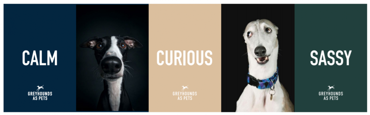
The new branding design direction offers a timeless logo design,which when embedded in words and imagery engages and connects with the target audience through emotion and wit, showcasing the individuality and character of greyhounds.
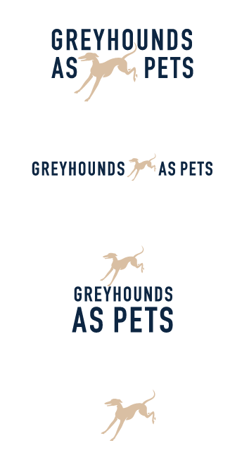
The Logo
The new logo design is clean, functional, stylish, professional, and offers variety. In other words, it can be applied large and small, on social media, printed collateral, banners, and greyhound and human merch.
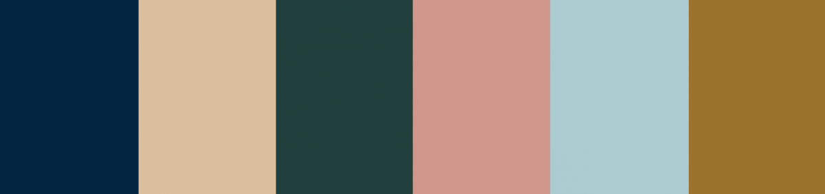
Colour Palette
The new colour palette alludes to class and sophistication, will still be warm, soft and inviting. It will appeal to anyone from people living on lifestyle blocks, to suburban families to city dwellers and professionals. The style and elegance of the logo and colour palette combination suits the grace and poise of greyhounds while not forgetting their bursts of silliness and their great big hearts.
Key Brand Associations
Community - The feeling you are becoming apart of a community with a trusted support network.
Confidence - Knowing that you are working with trusted partners and that the greyhounds are receiving the best care and attention from knowledgeable people who care.
Excitement - The excitement of owning your very own greyhound and engaging with a community of like-minded people.
Trust - Transparency of information about your Greyhound and feeling you are in safe hands as you are guided through the experience of adopting a new pet.
Visual Identity
The new branding visually and tonally supports the Greyhounds as Pets professional After Care programme and other programmes GAP has in place to inform and support its community of adopters. These professional programmes will offer peace of mind for first time adopters.
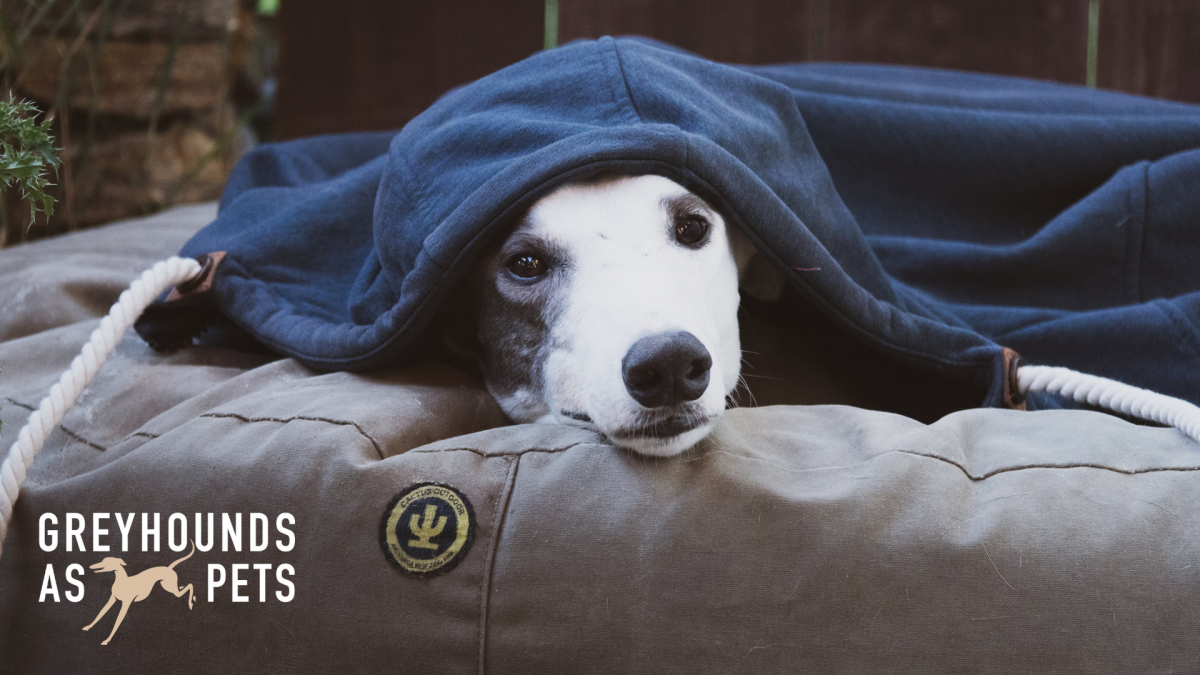
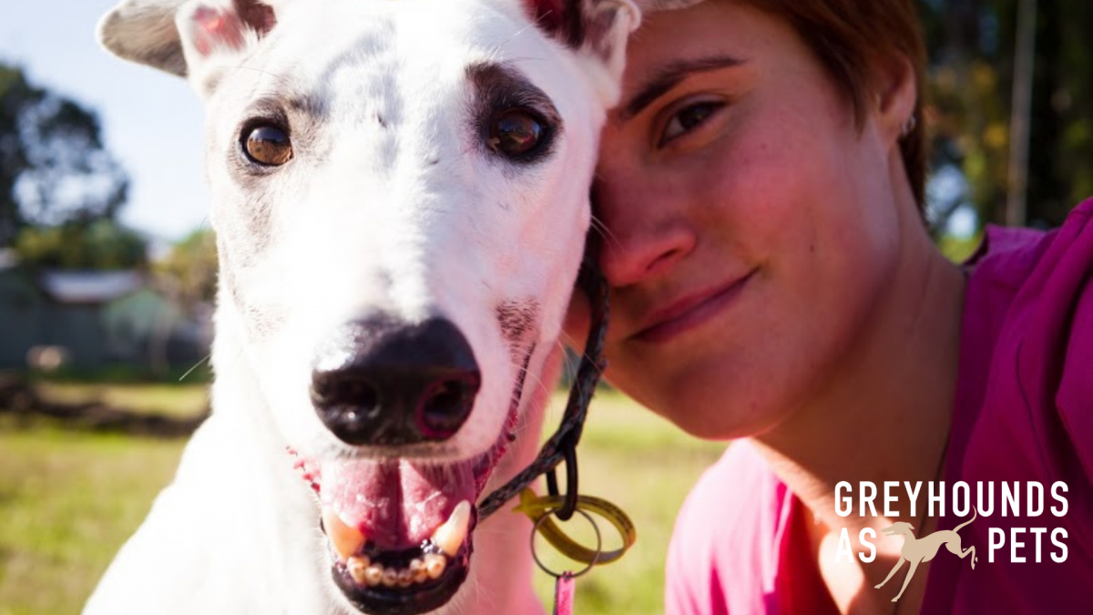
Our identity will also be based heavily on photo images of greyhounds and their families, because what better way is their to show who we than presenting the faces that represent why we do what we do.
Well, that's it...we hope you like it!
Don't forget to check out our revamped website at www.greyhoundsaspets.org.nz.
For more information about Ocular, visit www.ocular.nz.
![]()